What it don't get, I can't use. Now give me money.
When I first took this review, all I knew was the title: Rip Them Off. I wondered what it would really be about; surely, it wouldn’t be as obvious as it seems. The game basically told me, “I am that obvious, and don’t call me Shirley.”
Rip Them Off begins with a tutorial that’s only moderately helpful. There are a few tips regarding the customer lane color and what shape of shop they prefer. The game then throws you at the first level to see how you fare. The start was not great. After a couple of attempts to deduce the real nature of the business platforms and cross-functional operational groups, the paradigm shift happened and the strategic synergies fell into place so that we could provide world class performance to maximize the benefit to the key stakeholders…
Ugh. I didn’t mean to write a review in corporate mission statements—I think the game got to me. Sorry. To use something other than corporate gibberish, after a couple passes at the first level, the game showed me what it really is; Rip Them Off is a stylized tower defense set-up.
Once you come at it from that angle, things make much more sense (unlike the corporate mission statements).
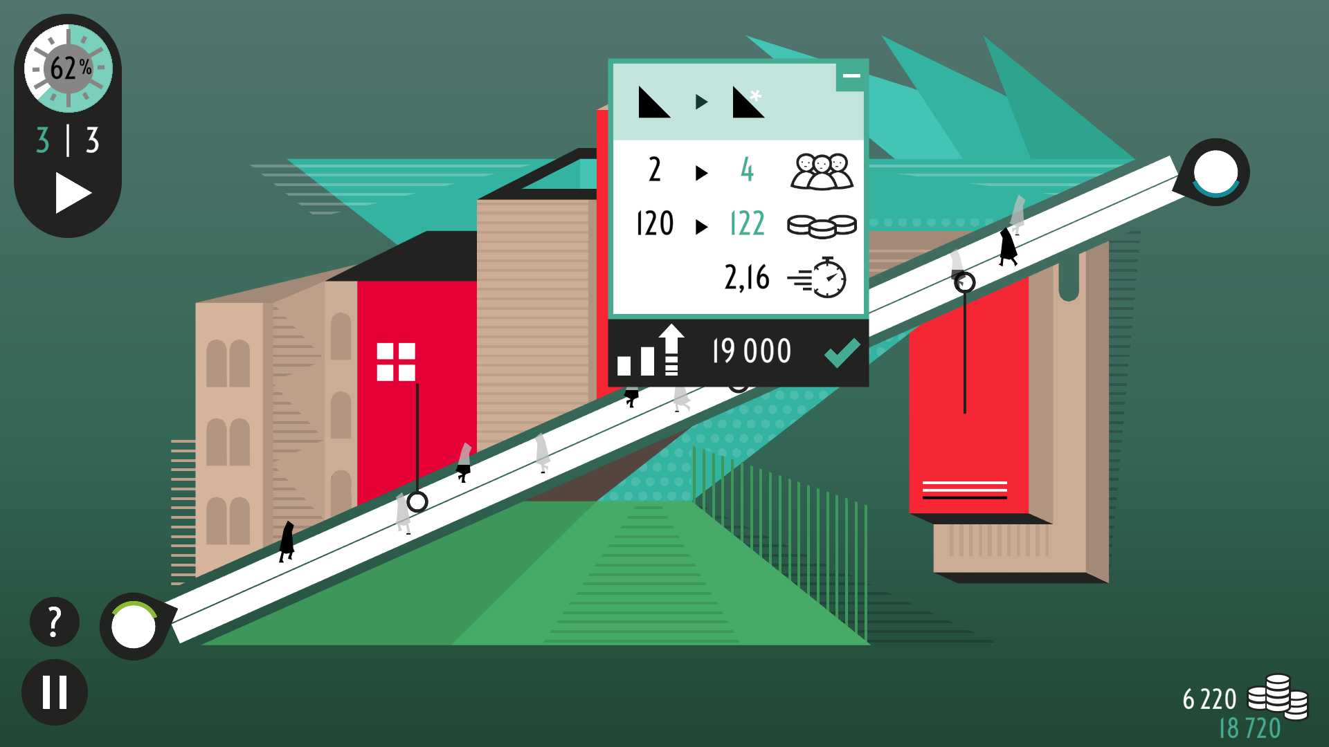
The elements of the game are fairly limited. You have a Board which provides you with directives and tips. There are a set of store types you can set up, each one with a different set of costs, shopper capacities, and income rates. There are paths the shoppers travel, and there are the shoppers themselves. The color of the path determines which store shape the shoppers will like best, which translates into spending more money. Remember, the game is all about getting the most money possible out of the shoppers.
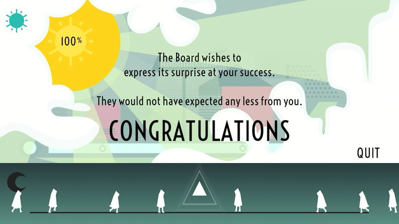
The basic premise is a dose of malignant capitalism, which can come off as cynical and jaded. The offset to this is the way the game presents “The Board” (of directors). There are some clever, satirical jabs at the business world and some funny bits in the game text. Even here, there is a mote of sadness as some of the “satire” is painfully close to reality.
While the layout and strategy are most like a tower defense game, the visuals are more of a stripped down, 1950s futuristic look at things. There are minimalist shapes and limited colors. The game uses a lot of geometric shapes, and the graphics are set up to make it obvious what type of store you have and how the paths interact with the stores. Your store shape/type is actually very important for a couple of reasons. The first is the path color feature mentioned earlier. Green path shoppers will spend more in the square store, the Purple path shoppers prefer the store shaped like a horizontal dash mark, and so on. The rub is that in successive rounds, the Green path shoppers will spend less per round in the same square shop. However, if they come across an upgraded square shop, or a different shaped shop, they will spend more again. As with the real world, novelty will draw consumers and entice them to spend.
Here is where real strategy comes in. Each store shape can handle a different number of customers at one time. Each store type also has a different cost to build it. As a quick aside, don’t forget you can upgrade or build a new store in the middle of a round. All you need is to have accumulated enough profit dollars to build it. The game does also allow you to pick a site, select a store type to build, and set it to build automatically when your profit account hits the necessary funds. The store types also take a different amount of time for each customer to do their spending and leave.
Lastly, they have different amounts of money they extract from the shoppers (or, as the game calls them, “dupes”). You may be willing to spend more money to develop a high customer capacity shop, but you end up collecting less money per transaction. To get more of their money, they need to be enticed into another shop (or two) along the path. Don’t forget, once they have spent money in a store of a particular shape, they will not enter the same shaped shop unless it is an upgrade from the last one.
The goal is to balance your shopper capacity to let everyone do some shopping and to entice them into enough types of stores so you can bleed them dry without missing anyone or having so much store capacity that it goes unused. It may sound harsh, but the game is called Rip Them Off, after all.
Now the tower defense methods make sense. It’s shop types, layout, customer pathways, and novelty instead of weapons/shields types, deployment, enemy path, and upgrades, but it plays the same. The big differences are the retro friendly game visuals and a jazz-oriented soundtrack. By the way, the music isn’t that bad, but the loop is a bit short.
Rip The Off looks fine on the large screen/TV. The controls are simple and responsive enough to not be frustrating, but I found it a little easier to use the console touch screen.
This isn’t the greatest thing in tower defense. The tutorial could be a little better, and the cynical approach to consumerism can be a bit depressing, but Rip Them, Off does require some serious consideration when you get out of the first couple of levels. There is some real planning to be done regarding store types, traffic flow, and upgrades from the start of the round to its end. There are not very many levels, but there is some fun to be had trying to beat them. The rounds don’t take a lot of time, so trying out new configurations doesn’t hurt your game time budget too much.
Review: Rip Them Off (Nintendo Switch)
Good
All things considered, Rip Them Off is a good, unique tower defense game with a comically cynical viewpoint. It has a limited number of levels, but it is also not very expensive, making it an ironically good deal considering the subject matter.


